 An official website of the United States government.
 Ask Dr. ALOHA: Working with the Concentration Graph
Matt, a new recruit to the River City Fire Department's hazmat team, is learning to use ALOHA by reading the helps and the ALOHA Examples [PDF, 1.9 MB] document and working through the example problems they contain. Right now, he's trying to be sure that he correctly understands what ALOHA's toxic threat zone estimate represents.
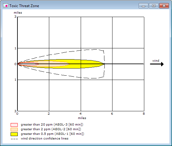
From the helps, Matt has learned that a toxic threat zone is an overhead view of the area where the ground-level pollutant concentration is predicted to exceed his Level of Concern (LOC) at some time after a release begins. That is, for any point within the threat zone, ALOHA predicts that the LOC will be exceeded at some time after the release begins—typically, this happens shortly after the cloud of pollutant gas reaches that point. Not all points within the threat zone will exceed the LOC for the same length of time.
He also notes that he can choose up to three LOCs. ALOHA will display the corresponding threat zones in red, orange, and yellow, and overlay them on a single threat zone picture like the one in Figure 1 below. By default, the red zone represents the worst hazard.
Accounting for Exposure Duration
Matt notes that although ALOHA's toxic threat zone estimates show where the concentration is predicted to rise above the LOC at some time after a release begins, it offers no information about how long the concentration at any point might remain higher than the LOC. He wonders whether ALOHA can provide that information.
Matt is interested because he has learned that the most commonly used kind of toxic LOCs are public exposure guidelines (such as AEGLs) or workplace exposure limits (such as TLV-STELs). (Typically, guidelines represent the hazard to the general public, while a standard or limit is a concentration that must not be exceeded in the workplace.) Each exposure guideline or standard has a specific definition, but generally each reflects the effects of a toxic agent on people.
In his reading, Matt has learned that most exposure guidelines and standards have an exposure (or contact) duration associated with them. For example, ERPGs have a 60-minute exposure duration and AEGLs are defined for five durations: 10 minutes, 30 minutes, 60 minutes, 4 hours, and 8 hours. However, only the 60-min AEGLs are included in ALOHA by default. ALOHA models a chemical release for up to 1 hour; the 60-min AEGL is the best choice—in most cases—because it matches the time length of the model.
Just what does exposure duration mean? At first glance, the concept of exposure duration may seem non-intuitive and technical. An example from early industrial practice may help make it clearer.
Years ago—before the toxic effects of mercury were well-known—hatters used mercury as part of the hat-making process. By doing this, hatters came into contact with small amounts of mercury. Hatters who were in contact with mercury long enough developed Mad Hatter's Disease, a syndrome that can cause many physical and psychological problems. Typically, because the hatters were exposed to relatively low concentrations of mercury, it took a few years for the symptoms of the disease to appear. If someone were to come into regular contact with higher concentrations of mercury, it would take less time for health effects to appear. In both cases, exposure to mercury doesn't immediately initiate particular health effects—it's necessary for that exposure to continue for some length of time. That length of time is shorter when a chemical is more acutely toxic or when it is present at a higher concentration. The reason why an exposure duration is associated with most exposure guidelines and standards is because exposure must happen for a length of time in order for health effects to develop. Many chemicals of particular concern to emergency responders, such as chlorine and ammonia, are so acutely toxic that they can be hazardous to people even if the exposure is brief.
Matt sees that although exposure duration fundamentally affects how a substance affects you, an ALOHA toxic threat zone by itself doesn't tell him anything about this important piece of information. He wonders: Why isn't it possible to see a threat zone showing the area where the LOC is exceeded for at least the exposure duration? Wouldn't that make more sense than just showing the area where the LOC is predicted to be exceeded for any amount of time?
Actually, the situation is not that straightforward. Let's examine some ALOHA concentration graphs to see why. These graphs show how the indoor and outdoor concentrations change at a particular location during the modeled release. Concentrations are shown in comparison to the chosen LOCs, so you can determine how long the toxic concentration was exceeded.
Some Concentration Graphs
Once ALOHA has displayed a toxic threat zone estimate for a release scenario, you can easily obtain a Concentration at Point graph, by either:
- Double-clicking on any point in the threat zone window, or
- Choosing "Threat At Point" from the Display menu and then indicating the coordinates of a location of concern.
Note: If you have placed a threat zone on a map in MARPLOT, you can view a concentration graph by clicking on a location of concern on the map, and then clicking on the ALOHA icon in the toolbar and selecting the Set Threat Point at Click Point option. (Check the ALOHA helps to learn more about viewing and using Concentration and other Threat at Point graphs.)
Below, Figure 2 shows an example Concentration at Point graph for a 1-ton chlorine release; the threat zone estimate for this release is Figure 1. For a point 1.36 miles downwind of the release, this graph shows how the outdoor and indoor concentrations (in parts per million) vary for 60 minutes after the start of the release. (Note that indoor concentrations are affected by the building type you choose for your scenario.) These concentration estimates are shown in comparison to the chosen LOCs—in this case, final 60-min AEGLs.
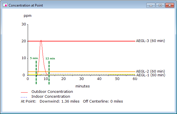
By examining Figure 2, you can see that the outdoor concentration line rises above zero about 5 minutes after the release begins, then remains above zero for about 7 minutes. According to the estimates in the Text Summary window, the outdoor concentration may reach a maximum value of 20.7 ppm, just above the 60-min AEGL-3 value for chlorine (20 ppm). On the other hand, the estimated maximum indoor concentration at this location is 0.746 ppm, just above the 60-min AEGL-1 value for chlorine (0.5 ppm).
The concentration graph in Figure 2 was generated by clicking on the furthest downwind point in the red threat zone, which is the point at which the outdoor concentration will be above zero for the longest length of time. In Figure 3, the concentration graph was generated by clicking on the furthest downwind point in the yellow threat zone.
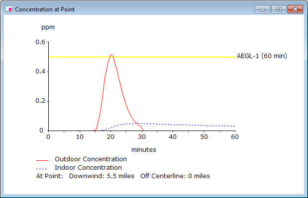
In Figure 3, you can see that at this point 5.5 miles downwind from the initial release site, the outdoor concentration is predicted to remain much lower. (According to the estimates in the Text Summary window, the outdoor concentration may reach a maximum value of 0.513 ppm.) However, the outdoor concentration line rises above zero for longer—about 16 minutes.
Note: The horizontal LOC lines are only shown when the predicted outdoor or indoor concentrations approach them. So in this case, only the AEGL-1 line is shown. Although the height of the outdoor concentration curve may appear larger than the one in Figure 2 at first glance, a careful review of the vertical axis scale will show that Figure 3 is shown at a more zoomed-in scale. If Figure 3 had the same scale for concentration as Figure 2, then the outdoor concentration curve for Figure 3 would be much smaller.
The two graphs in Figures 2 and 3 represent cases where a 60-minute exposure duration for the outdoor concentration may be conservative—that is, it may overestimate the threat. The 60-min AEGL values are typically lower than the 10-min or 30-min AEGLs, because the 60-min AEGLs represent the hazard from a longer exposure. When the exposure is short, people can be exposed to higher concentrations of the chemical before they experience the same health effects. In Figures 2 and 3, ALOHA predicts that the exposure duration for the outdoor concentration is about 7 and 16 minutes, respectively, at the specified locations. In this case, 10-min AEGLs may better represent the outdoor hazards of this release.
Note: ALOHA only includes the 60-min AEGLs, but you can look on the CAMEO Chemicals site for the AEGLs for all exposure durations.
Below, Figure 4 shows a concentration graph for the same release scenario, but using 10-min AEGLs instead. (See the Ask Dr. ALOHA article on choosing toxic LOCs for more information on entering your own LOCs.)
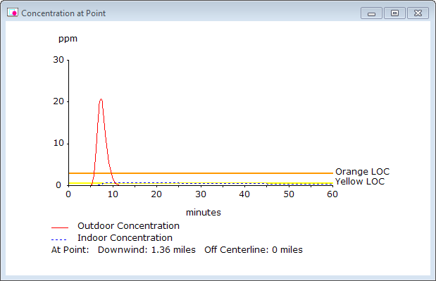
Note that in Figure 4, the outdoor and indoor concentration predictions are the same as in Figure 2 (because both graphs are for the same location), but the relationship between those predictions and the LOC lines has changed.
- In Figure 2, the outdoor curve briefly passes above the 60-min AEGL-3 line (20 ppm).
- In Figure 4, the outdoor curve does not even reach the 10-min AEGL-3 line (50 ppm). In fact, that Red LOC line is not shown, because the predicted concentration is not close enough to the AEGL-3 value.
In a scenario like this one, using the default AEGLs in ALOHA may overestimate the outdoor threat. The 60-min AEGLs are lower values, so they are easier to exceed. This is why the estimated outdoor concentration rose above the 60-min AEGL-3 line in Figure 2, but only rose a little less than half way to the 10-min AEGL-3 (50 ppm) in Figure 4.
Overestimating the threat in this manner is not necessarily bad. The LOCs will be exceeded more easily, so the predicted threat zones will be larger. (For example, the red threat zone based on the 60-min AEGL-3 is about 1.4 miles long, but the red threat zone for the 10-min AEGL-3 is about 0.9 miles long.) This means that responders may try to keep people out of a larger area than necessary, but this approach is conservative—that is, it is a cautious approach that is more protective of the public. However, if a shorter-duration LOC is appropriate for your release, you may want to use that instead of the defaults, because it will provide a more accurate threat zone estimate.
Remember, ALOHA's threat zone represents its "best guess" of the area where a toxic hazard may potentially exist. To use ALOHA most effectively and best understand the hazard posed by a particular release, view concentration graphs at points of concern within the threat zone to assess whether the exposure duration for the chosen LOCs are appropriate for the release. As you do so, bear in mind that ALOHA's threat zone represents the area where concentrations may exceed the LOC as long as the wind does not shift direction. If the wind changes to blow in a different direction, type the new direction into ALOHA and run your scenario again. And above all, remember that all estimates from ALOHA—or any other model—represent best guesses, not exact values.
Questions: Contact us with questions, comments, or suggestions about ALOHA.
Go back to the Ask Dr. ALOHA overview.