 An official website of the United States government.
 ALOHA Threat Zones and Other Output
ALOHA displays your hazard modeling results in four windows: threat zone, text summary, threat at a point, and source strength. The contents of each window can be printed, pasted into other documents, or saved.
Threat Zone Window
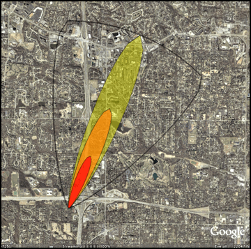
This window displays up to three threat zones overlaid on a single picture. A threat zone represents the area within which the hazard level (toxicity, flammability, thermal radiation, or overpressure) is predicted to exceed your Level of Concern (LOC) at some time after a release begins.
If you choose three LOCs, ALOHA will display the threat zones in red, orange, and yellow. By default, the red zone represents the worst hazard. For dispersion scenarios, you may also see dashed lines along both sides of the threat zone, which represent uncertainty in the wind direction.
Threat zone estimates can also be displayed in a variety of mapping programs, including MARPLOT, ArcGIS, Google Maps, and Google Earth.
Text Summary Window

This displays the scenario information you entered; physical properties of the selected chemical; and ALOHA's source strength, threat zone, and threat at a point estimates as text.
Threat at a Point Window
This window displays specific information about the hazards at a selected point of interest (such as a school or hospital) that is in or around the threat zones. ALOHA will display the Threat at Point either as a graph or as text. For example, if you choose to see the Threat at Point for a toxic gas dispersion scenario, ALOHA will display a graph of concentration versus time like the one at right.
Source Strength Window
This displays either the predicted rate at which the chemical enters the atmosphere or the burn rate, depending on the scenario. The graph shows the rate (source strength) for the first hour after a release begins or until the release is complete, whichever is shortest.
ALOHA predicts source strength as a series of hundreds of brief timesteps. These values must be averaged into fewer steps so that calculations can be completed quickly.
Questions: Contact us with questions, comments, or suggestions about ALOHA.