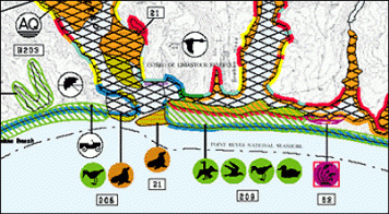
Anatomy of ESI Maps
Environmental Sensitivity Index (ESI) maps provide a concise summary of coastal resources that are at risk if an oil or chemical spill occurs nearby. Examples of at-risk resources include birds, shellfish beds, sensitive shorelines (such as coral reefs), and public beaches and parks. This section is a brief introduction to the basic elements of ESI maps.
Front of ESI Maps
Shorelines are color-coded to show their sensitivity to oiling. For example, shorelines shown in red at right are salt marshes that are especially vulnerable to oil. Symbols mark locations important to spill responders, such as areas where seals or sea lions congregate or breed (marked with the brown seals and sea lions symbol), areas where different kinds of birds concentrate for feeding or nesting, and areas used by people (such as the aquaculture facility shown on this map with the AQ or the recreational beach marked by the sun umbrella).
Learn more about the three kinds of information shown on the front of ESI maps:
- Shoreline Rankings: Learn how shorelines are ranked according to their sensitivity to oil, the natural persistence of oil, and the expected ease of cleanup after an oil spill.
- Biological Resources: Learn how ESI maps categorize and display animals and habitats that are sensitive to oil or chemicals, and habitats that are themselves sensitive to spilled pollutants (such as coral reefs).
- Human-Use Resources: Learn how ESI maps categorize and display the location of human-use resources (such as public beaches) that are vulnerable to oil or chemical spills, or that could be used as access points for spill cleanup.
Back of ESI Maps
On the back of ESI maps, there are tables showing when species are present in the areas shown on the front of the maps. The data tables also indicate their seasonality, breeding times, and threatened/endangered status. There is also information about human-use resources (such as parks), including contact information as appropriate.

The ESI data tables indicate:
- Which species of animals and plants are present, the months when they are present, and often an indication of the concentration (abundance) of a particular species.
- Which species are listed as threatened or endangered.
- When birds are nesting, laying, hatching, and fledging.
- When fish are spawning or migrating through the area.
- When shellfish are mating or spawning.
- When marine mammals are breeding, calving, or pupping.
- How to contact parks, historic sites, and other facilities in the area.
Notes: (1) The information on the back of an ESI map is also available as a GIS table. (2) You can download the ESI Species List to see the complete list of species that may be shown on ESI maps. (Not all species are shown on every ESI map.)
Map Design
The ESI project team has developed a systematic method for creating ESI maps, which is summarized here. Others are welcome and encouraged to adopt this method when it proves useful to them.
On ESI maps, each shoreline is color-coded to indicate its sensitivity to oiling. Warm colors indicate the most sensitive shorelines, and cool colors indicate the less sensitive. Large habitat areas (such as tidal flats and wetlands) are shown as polygons filled with a pattern of the appropriate color.
The biological resources shown on ESI maps also have standardized colors, which are shown on the table below. Each kind of animal has a designated color--for example, birds are green. So on ESI maps, locations where birds can be found are indicated using point symbols and/or polygons that are colored green. When a biological resource exists in a small area (such as a bird nesting site), it is indicated on an ESI map by a point symbol. However, most biological resources encompass larger areas. In these cases, the resource location is represented on ESI maps using polygons with standardized color and hatch pattern (shown below). Fish streams are usually represented as lines.
| Kind of Resource | Color | Polygon Pattern |
|---|---|---|
| Fish | Blue |  |
| Shellfish/Insects | Orange |  |
| Birds | Green |  |
| Marine Mammals | Brown |  |
| Terrestrial Mammals | Brown |  |
| Reptiles & Amphibians | Red |  |
| Habitat/Rare Plants | Purple |  |
| Multiple Elements | Black |  |
Note: When a species is very widely distributed within an area covered by an ESI map, its presence is indicated by the notation "common throughout" and a polygon does not appear on the map because it would obscure other map features. However, in the GIS data table, the bounding polygon is included, allowing accurate queries of location and extent of the various species.
Most human-use features (such as public beaches and aquaculture facilities) exist in a small area and are represented by human-use point symbols. Larger areas such as parks, preserves, protected areas, and wildlife refuges are shown as polygons.
ESI maps are best printed on paper measuring 11 by 17 inches (28 by 43 centimeters). ESI maps are plotted on 7.5-minute United States Geological Survey (USGS) quadrangle maps at a scale of 1:24,000, with the exception of the maps for Alaska that are plotted on 15-minute USGS maps at a scale of 1:64,000.
More Information about ESI Maps
Sample ESI Atlas [PDF, 2.3 MB]: This sample, from the 2007 ESI atlas for Alabama, includes a sample ESI map with seasonality data; background information about shoreline habitat ranking and sensitive biological and human-use resources; a list of species included in the atlas; a description of Alabama shoreline habitat types; a map legend; and guidelines for interpreting ESI maps.
 An official website of the United States government.
